Monday, February 19, 2007

QUAI BRANLY

This is a very interesting project Julia recommended me to look at for my quarry and for my flights of steps. It's the Museum of primitive Art in Paris near the Tour Eiffel, the garden has been laid out by Gilles Clement and the lighting is by artist Yann Kersale'. Really a fantastic scheme, especially at night for the effects created by coloured lights, I willl consider it when it will come to lighting in my quarry! Does anyone know what the coloured cilinders of light are?


DETAIL DESIGN- CHOSEN OPTION

This is an image of my prefered option for the detail area: I have modified the exhibition space and now I'm happier with the new layout. 3m high walls are going to be added to the terraces: they look like big walls of sandstone sliced out the ground. They are inspired by the concept of the quarry and are reminiscent of the hill that existed before the quarry was excavated.
All of them have cliff vegetation at the top.
I have also resolved the terraced pools and the playground. Let's see how the tutorial goes today!

Thursday, February 08, 2007

MY BUSINESS CARD AND LETTERHEAD

Here are my options for the business card and for the letterhead. I had a productive session with David today and I got some useful advice. Basically I'm using a drawing I did for Planting Design and I'm cropping it to fit my A4 and my business card.
I like the idea of using a piece of work I have done especially this one because I really enjoyed the course and I really enjoyed rendering my proposal.
So, following David's advice I'm going to use a detail of the drawing at the back of my business card and I'm going to have just my name and contact details on the other side. The front of the card is not ready yet because I'm not sure about the font.
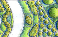
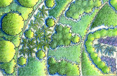
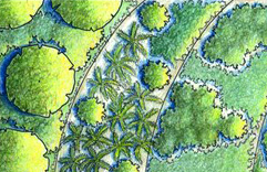
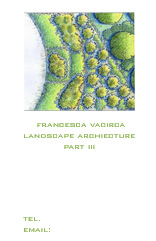
I have three options for the image at the back, three different croppings, here they are:


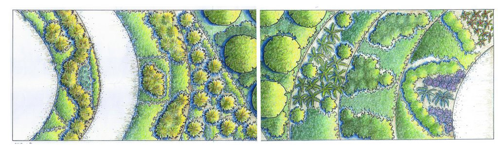
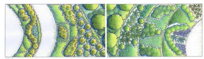
Otherwise I could use the whole drawing and print it on a long strip of paper and then fold it and write my contact details inside. Here is the whole strip:


Other two options are the following, not very enthusiastic about them, I think the cropped detail is going to look really tiny once printed:


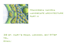
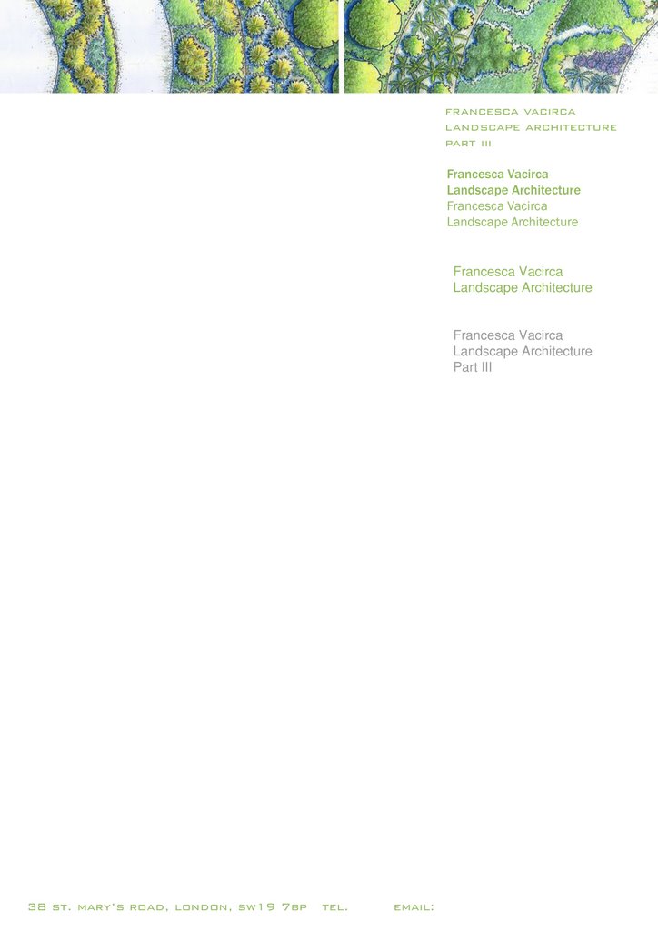
This is my letterhead, at the moment it is full of text because I'm experimenting with different fonts:


Feel free to leave any comments on my work if you think there is something that needs to be improved, any comments are useful at this stage!
Thanks and see you tomorrow!

Tuesday, February 06, 2007

FEELING STUCK.....

I'm in the middle of a design crisis..I'm stuck: I've spent the whole afternoon trying to change the central area of my detail design, I've come up with 15 different options and I don't like any of them. I don't know if I'm a perfectionist, or if I've run out of ideas or if my design scheme is wrong all together or if it is a combination of all these things.
It's strange because when I was working on my planting design project with Andrew Wilson I experimented with circular shapes and curves and I realized that once you start to use them you have to apply them to the whole design. I was told they are tricky and anything different from them looks out of place.
But now that I'm using squared geometric shapes for St. Leonard's I'm feeling trapped too: anything looking different is in contrast and must be redesign.
The area where I have my curved walls must be redesign from scratch again and the options I have designed this afternoon are all based on the geometric shapes I have used for my terraced gardens at the top of the park.
At the moment I feel that the different areas of the park are disjointed and the whole scheme needs to be redesigned because I don't like it... hope I'll get some help on Friday with Julia!